


Reports
Main menu / Profilt and Loses
By selecting from the main menu, Profit and Loses, will open Submenu Profit and Loses/ current page / and Statement of Availability,Report by taxes ,Profit from client and report client
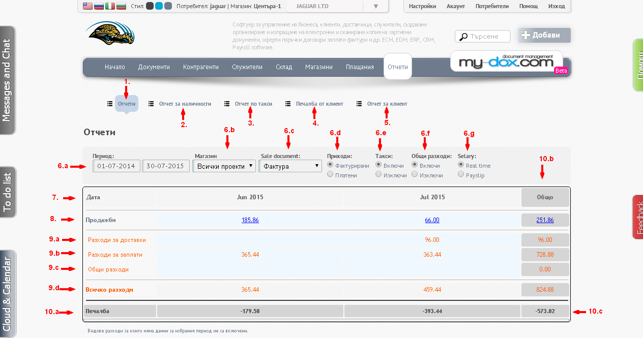
There you can visually see graphically represented information for your reports.
In the Period (6.a), select a time interval for which to display reports. From Inventory(6.b) from the drop-down list, select Project (object) which is (all or specific), of Sale document (6.c) - Fida documents (invoices, delivery notes or both). Highlight what to show: Income (6.d) - invoiced or only paid fees (6.e) Total cost (6.f) - to show or not and Salaries (6.g). In all choices, the system will automatically update the information.
You will receive tabular information on your income and expenses. Line 1 (7) shows the date / period for which a statement in months that are available.
Line 2 (8) shows sales for the corresponding months in the last column (10.b) is the total amount of lines. The next few lines show the various costs that have - exp supply (9.a), Salaries (9.b), Overheads (9.c), in Overheads (9.d) are given in total. All this again for the corresponding period in months and Total.
The latest row (10.a) shows the difference between revenue and expenditure, i.e. The profit (or loss, if negative) for the specified period of months, in the last field (10.c) is an end result (Total).
Types of costs for which no data for the period are not included.
Under tabulations you will see a graphical representation of information.
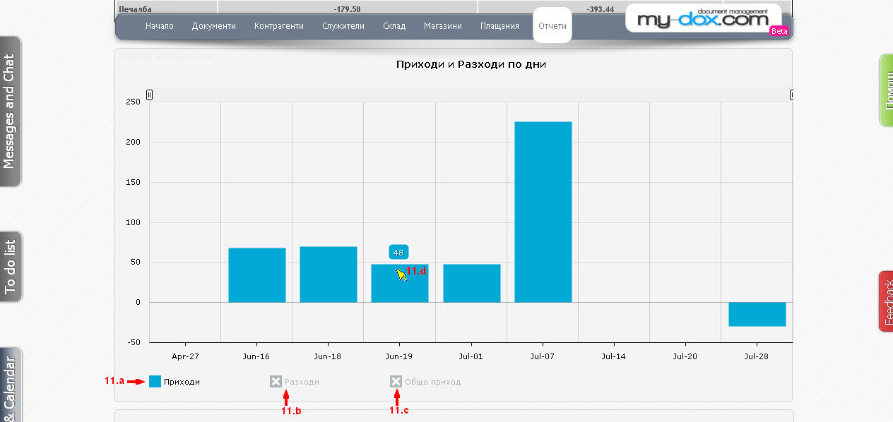
The first chart shows the revenue and expenditure of days.
At the bottom you'll see a legend, it can inclusions and off what is displayed. You want to display, click on the color box in front of the name. You can choose between Income (11.a), Costs (11.b) and total revenue (11.c). In reference to a graphic with your mouse, you will see the numerical value (11.d).
To view all, select the appropriate fields (11.a, 11.b and 11.c).
Also you can use the 2 small buttons (12.a and 12.b), at the top (left - right) to change the magnification. Just click with your mouse and drag left and right. To return the chart to its original state, return back sliders or click the Show all (12.c)..
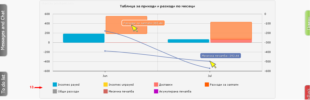
The following is a table of revenues and expenses by month. At the bottom is a legend (13). Indicating which color what shows. In an indication of any item with your mouse, display detailed information.
Following several pie charts showing Revenue brands, Revenues by product and Revenue provider.
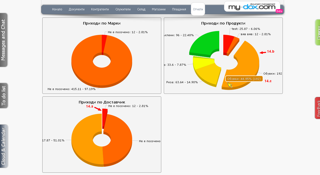
Here with a mouse click (14.a), their respective share stands out, leaving the circle. You can click on the partition as you want from the chart (14.b), so all will be released and will be easier to read. And when pointing the mouse, you'll also receive detailed information (14.c).
The last graph gives information about the status of the project (Projects).

(15.a) shows Projects, (15.b) is a legend indicating which element in which color, what shows and (15.c) is a scale. In an indication of an element with a mouse (15.d) will see detailed information about it.